
Typography drives conversions before audiences read a single word. Research reveals that appropriate font choices increase conversion rates by 35%, while a simple font size adjustment from 10px to 13px has improved conversions in documented A/B tests. The serif font Baskerville increases message credibility by 1.5% compared to other typefaces—enough to significantly impact bottom-line results.
Yet most brands treat typography as an afterthought. The disconnect between message and medium costs conversions daily. A luxury brand using casual fonts loses credibility instantly. Tech startups choosing ornate scripts signal confusion rather than innovation.
This guide presents the 10 best fonts for ads, backed by data and real-world brand examples. Whether targeting premium audiences, designing banner ads, or building multi-channel campaigns, strategic typography separates memorable advertising from noise.
The Science Behind Font Selection
Font psychology operates at subconscious levels. Google and IBM research found that serif font Georgia achieved 7.9% faster reading speeds than sans-serif Helvetica, though comprehension rates remained equal. Meanwhile, participants perceived serif fonts as more credible despite performing better with sans-serif options—a disconnect that reveals why testing matters.
Typography functions as body language for brands. Studies from MIT demonstrate that poorly designed typography causes readers to frown, activating the amygdala—the brain region governing emotional memory formation. Good typography doesn't just improve readability; it shapes emotional associations with your brand.
Quick Reference: Font Categories for Advertising
Readability trumps beauty. Increasing body text from 10px to 13px has proven conversion impact. For optimal legibility, use 16px minimum for body copy—matching the perceived size of printed text when accounting for screen distance.
Best Fonts for Ads Targeting Premium Audiences
Luxury positioning demands typography that signals exclusivity instantly. Research shows Baskerville increases perceived credibility by 1.5%—enough to shift purchasing decisions in premium markets where trust determines conversions.
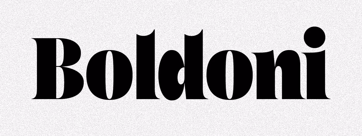
1. Bodoni
Brand Examples: Vogue magazine, Nirvana logo, Giorgio Armani
Best For: Fashion, jewelry, luxury beauty, high-end hospitality
Bodoni delivers unmistakable luxury through dramatic thick-thin stroke contrast and vertical emphasis. Its geometric precision communicates meticulous craftsmanship—why fashion houses from Armani to independent boutiques rely on it for brand materials.
Usage Guidelines: Headlines and logos only. Minimum 14pt for digital, 18pt for print. The high contrast makes thin strokes disappear at small sizes. Pair with neutral sans-serif body text (Helvetica, Lato) for maximum impact.
Web Font Option: Libre Bodoni (Google Fonts) provides similar elegance for digital campaigns.
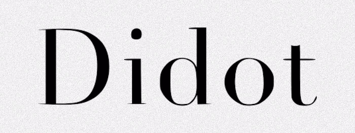
2. Didot/Playfair Display
Brand Examples: Chanel (custom Didot), Harper's Bazaar, Zara
Best For: Ultra-premium fashion, editorial advertising, luxury lifestyle
Didot and its digital cousin Playfair Display epitomize Parisian elegance. Chanel built its entire visual identity around Didot's refined proportions. For digital advertising, Playfair Display offers similar sophistication with screen-optimized rendering.
Usage Guidelines: Display size (24pt+) for maximum impact. Works exceptionally well for banner ads targeting affluent demographics. Pair with Lora or PT Serif for body copy.
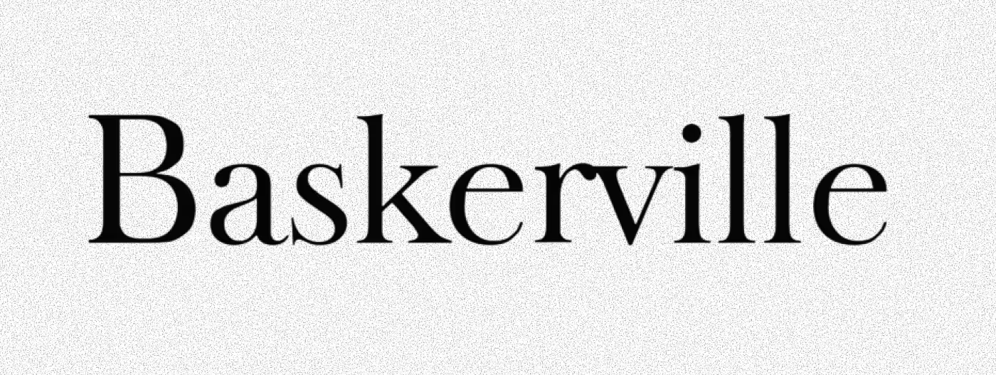
3. Baskerville
Brand Examples: TOMS, University of Birmingham, Kate Spade (pre-rebrand)
Best For: Financial services, law firms, heritage brands, premium B2B
Baskerville increases message credibility by 1.5% compared to other fonts—documented in research across 45,000 participants. This transitional serif bridges classical authority with modern readability, making it ideal for brands requiring immediate trust establishment.
Usage Guidelines: Versatile across all sizes. Use 14pt minimum for body text. Performs equally well in print and digital. Pair with Montserrat or Source Sans Pro for contemporary contrast.
Best Fonts for Banner Ads and Digital Advertising
Digital advertising demands immediate comprehension. Audiences scroll past ineffective typography in milliseconds. These fonts maximize legibility across devices while maintaining brand impact.
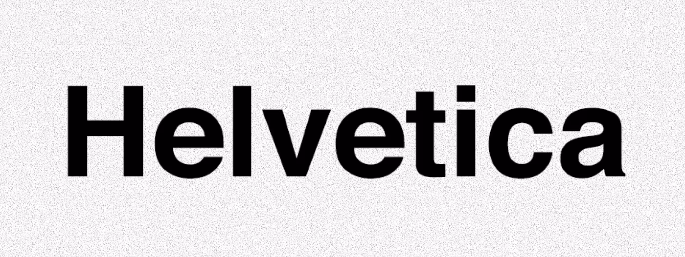
4. Helvetica
Brand Examples: American Airlines, BMW, Microsoft, Lufthansa, Panasonic
Best For: Corporate, tech, SaaS, professional services, broad audiences
Helvetica's neutral clarity makes it the default for brands prioritizing universal recognition. Its uniform stroke width ensures legibility from desktop displays to mobile banners. Neutrality becomes strength—the font disappears, letting your message dominate.
Usage Guidelines: Body text at 14-16px minimum. Works at any size. Helvetica Neue offers improved spacing for digital. Pair with Helvetica itself (varied weights) or Georgia for serif contrast.
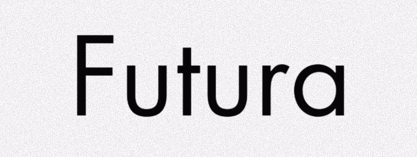
5. Futura
Brand Examples: Louis Vuitton, Volkswagen, Supreme, Nike (select campaigns), Absolut Vodka
Best For: Innovation-focused brands, design agencies, automotive, premium consumer goods
Futura's geometric precision built on circles and straight lines embodies Bauhaus modernism. Louis Vuitton's entire brand identity leverages Futura's forward-thinking aesthetic to communicate luxury through minimalist design.
Usage Guidelines: Headlines at 18pt+. The distinctive geometry shines in display sizes. Avoid extended body copy—character width varies significantly. Pair with Avenir or Lato for balanced hierarchy.
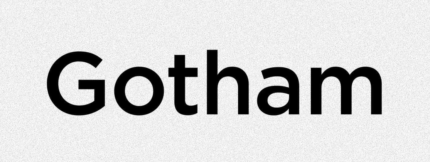
6. Gotham
Brand Examples: Obama campaign, Spotify, Netflix, Saturday Night Live, GQ Magazine
Best For: Professional services, media, entertainment, brands requiring trustworthy authority
Gotham communicates contemporary credibility. Originally commissioned for GQ, it gained widespread recognition through political campaigns. Its balanced letterforms signal approachability without sacrificing professional weight.
Usage Guidelines: Versatile across all applications. 13px minimum for web body text. Multiple weights enable effective hierarchy within single-font designs. Pair with Sentinel or Merriweather for editorial sophistication.
Versatile Fonts for Multi-Channel Campaigns
Cross-platform consistency requires fonts performing equally well in digital banners, print brochures, and social media graphics.
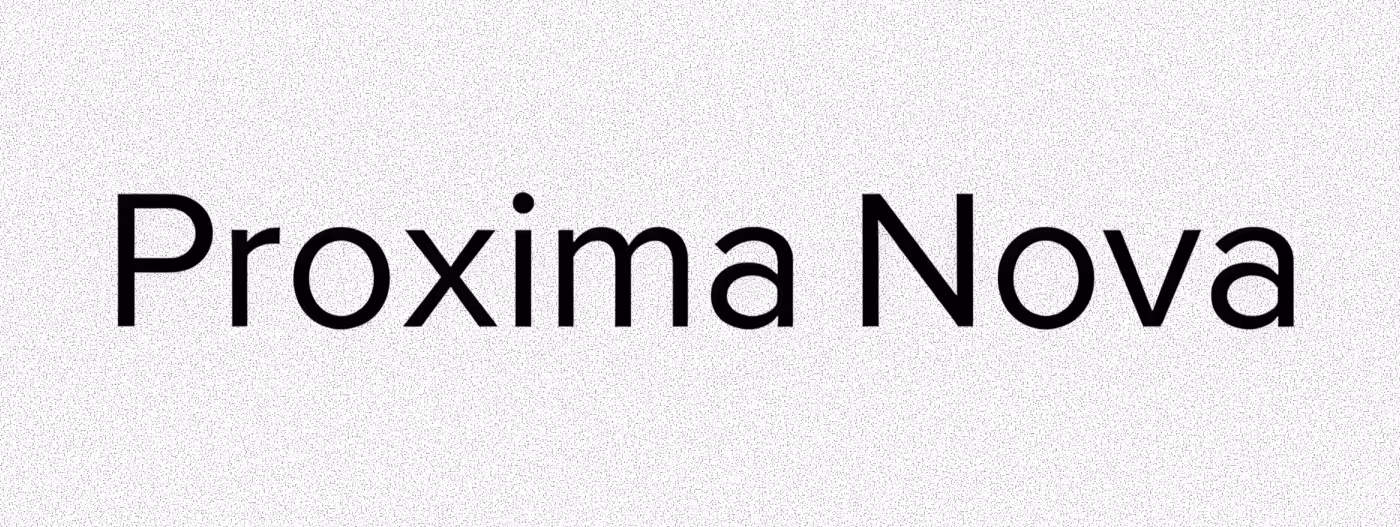
7. Proxima Nova
Brand Examples: Buzzfeed, Wired, Mashable, NBC News
Best For: B2C brands, media, healthcare, retail, diverse audiences
Proxima Nova balances warmth with professionalism. Its humanist proportions make advertising approachable rather than corporate. Multiple weights enable flexible hierarchy across all formats.
Font Pairing: Proxima Nova + Merriweather = modern editorial style
Web Alternative: Montserrat (free Google Font with similar characteristics)
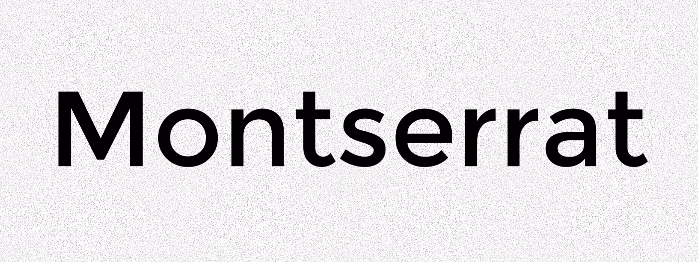
8. Montserrat
Brand Examples: Mailchimp, Dropbox (select materials), tech startups
Best For: Startups, creative agencies, modern B2C, design-conscious brands
Geometric clarity with personality distinguishes Montserrat from neutral alternatives. Inspired by Buenos Aires signage, it offers contemporary appeal without sacrificing legibility. Free availability through Google Fonts makes it ideal for budget-conscious campaigns.
Font Pairing: Montserrat + Lora = balanced modern/classic contrast
Specialized Fonts for Targeted Contexts
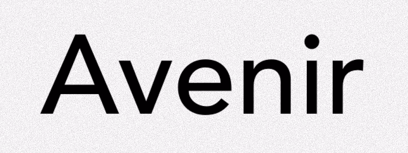
9. Avenir
Brand Examples: Apple (institutional materials), Adobe, LinkedIn
Best For: Technology, innovation sectors, professional networks
Avenir translates to "future" in French—apt for its forward-focused aesthetic. Harmonious geometric structure communicates precision and accessibility simultaneously. Apple's adoption across institutional materials validates its professional credibility.
Usage Guidelines: 14px minimum for web. Excellent cross-platform consistency. Pair with Freight Text or Charter for elegant contrast.
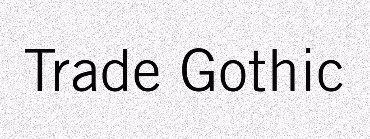
10. Trade Gothic
Brand Examples: Samsung, Boeing, industrial manufacturers
Best For: Manufacturing, construction, B2B, industrial sectors, logistics
Trade Gothic communicates no-nonsense reliability. Its sturdy letterforms signal durability and professional competence—qualities B2B audiences prioritize over aesthetic innovation.
Usage Guidelines: Excellent readability in challenging conditions (trade shows, outdoor). Pair with Rockwell or Clarendon for reinforced industrial aesthetic.
Proven Font Pairing Formulas
Effective typography uses maximum two font families. These combinations deliver proven results:
Premium Positioning:
- Playfair Display + Lato (editorial luxury)
- Bodoni + Helvetica (high-fashion contrast)
- Baskerville + Montserrat (traditional meets modern)
Digital Performance:
- Montserrat + Merriweather (startup favorite)
- Proxima Nova + Georgia (professional warmth)
- Gotham + Freight Text (contemporary authority)
B2B Credibility:
- Trade Gothic + Rockwell (industrial strength)
- Avenir + Charter (tech professionalism)
- Helvetica + Baskerville (timeless trust)
Implementation Checklist: Making Your Font Selection Work
Size Requirements by Medium:
- Mobile banner ads: 16px minimum body, 24px+ headlines
- Desktop display ads: 14px minimum body, 28px+ headlines
- Print materials: 10pt minimum body, 18pt+ headlines
- Billboard/OOH: Test visibility at 50 feet
Technical Specifications:
- Line spacing: 1.5x font size minimum (research shows 2.5x optimizes reading speed)
- Character count per line: 50-75 for optimal readability
- Paragraph length: 2-4 sentences maximum for ads
Web Font Loading:Use Google Fonts or Adobe Fonts for licensed access to premium typefaces. Implement font-display: swap in CSS to prevent layout shifts affecting Core Web Vitals.
Five Critical Mistakes That Kill Ad Performance
1. Size Too Small (Most Common Error)
40% of Americans are nearsighted. Small fonts are the #1 complaint in usability studies. Minimum 16px for body text isn't optional—it's backed by research showing improved engagement and emotional connection.
2. Using 3+ Font Families
Multiple typefaces create visual chaos. Professional advertising uses one or two fonts maximum. Create hierarchy through weight, size, and color—not font variety.
3. Poor Mobile Optimization
Mobile delivers majority digital ad impressions. Test every font choice on actual smartphones under various lighting. If text isn't instantly readable in 3 seconds, reselect.
4. Ignoring Font Psychology Mismatches
Comic Sans on financial services ads. Ornate scripts for tech startups. These disconnects cost conversions because typography communicates before copy. Match font personality to brand values or lose trust instantly.
5. Sacrificing Legibility for Uniqueness
Beauty without readability equals failure. When testing reveals audiences hesitate or misread text, adjust immediately. Clarity wins conversions; creativity without clarity loses money.
Conclusion: Typography as Competitive Advantage
Strategic font selection drives measurable results: 35% conversion rate improvements, 1.5% credibility increases, 7.9% faster reading speeds. These aren't marginal gains—they're competitive advantages that compound across every customer touchpoint.
The 10 fonts highlighted here represent proven choices across contexts. Bodoni and Didot signal luxury positioning backed by brands like Chanel and Armani. Helvetica and Gotham deliver digital clarity trusted by Netflix and Spotify. Proxima Nova and Montserrat balance versatility with personality for multi-channel campaigns.
Action Steps:
- Audit current typography against your brand positioning
- Test font pairings from proven combinations above
- Implement 16px minimum body text across digital properties
- A/B test headline fonts for conversion impact
Typography mistakes cost conversions daily. Small fonts frustrate 40% of audiences. Multiple typefaces create confusion. Poor mobile optimization loses majority traffic. These failures are preventable through data-driven font selection.
Ready to elevate your brand through strategic design? Explore our professional web design and branding services or discover more design and marketing insights for competitive advantage.